
Updated version: A dashboard view of Modules in Canvas v2
Canvas’s Modules page is a great way to show students both what is available to them and their progress through those materials. However, I’m concerned that:
- it may be overwhelming to see everything in your course on a single page
- it present a very linear view of a course – this may be appropriate in some circumstances but is certainly not appropriate in many HE courses.
The typical solution to this appears to be to create a course home Page where you can wrap/organise your content as you see fit. Two great guides to this are:
- Stephanie Sanders‘ Creating an inviting course home page and
- Chris Long‘s Home Sweet Homepages without Tables
However, this approach has two disadvantages:
- I’ve already spent time and energy organising, titling and indenting my content – why should I have to create a page of links pointing to that content?
- The Modules page gives you great feedback on progress through your course – which content you have ‘completed’, what’s next, etc. A links-based home page is going to hide all this from you.
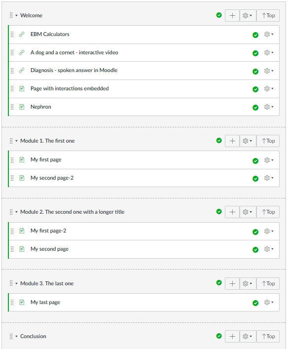
So, what we need is some way of making the Modules page more navigable. There are plenty of requests for this on Canvas’s Community pages and it would indeed be more sensible for Instructure to tackle this themeselves. However, if you’d like something that will work in the shorter term and are happy to add your own js/css, you might find the approach below interesting.
Autogenerating a Modules ‘Dashboard’
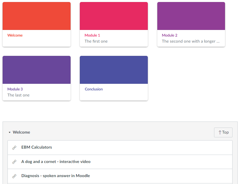
With some fairly simple JQuery, a custom stylesheet and a module naming convention it’s relatively simple to autogenerate a ‘dashboard’ of Canvas-style cards which gives students an overview of, and an easy way to navigate to your modules. ‘Top’ buttons on every Module give a quick way back to the dashboard no matter how many modules your site contains.
The JS:
Note that this assumed that Modules are named:
Module x. My module description
The code splits the Module name, based on the characters specified by the ‘delimiter’. So, in this case, my title will be ‘Module x’ and the sub-title will be ‘My module description’. You will need to chnage this caharacter if you want to split on say ‘:’.
and the CSS:
You’ll see that this css is very largely the same as the Canvas Dashboard styles but I have renamed them ‘ou-‘ so that we can make sure they are available on the Modules page and so that we can alter them as necessary.
Hope that’s useful to someone. It’s a work in progress e.g thinking about pulling in Module progress indicator(s), number of items in module, etc. Do get in touch is you spot any problems.