
WARNING: Note that themes allow you to upload .css and .js files for both the web and app versions of your Canvas site BUT the app does not provide JQuery so you’ll need a plain JS version of your code for the app…or pull in JQuery.
The Bootstrap progress bar doesn’t appear to be available within pages. Instead, use the JQueryUI progress bar (for the web version of Canvas anyway):
I have styled this in one of our courses as follows.
HTML
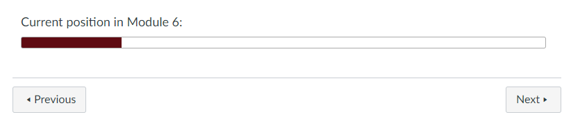
<div class="ui-progressbar ui-widget ui-widget-content ou-ProgressBar module_6" style="width: 100%; height: 15px;" role="progressbar" aria-valuemax="100" aria-valuemin="0" aria-valuenow="19">
    <div class="ui-progressbar-value ui-widget-header ui-corner-left ou-ProgressBarBar" style="width: 19%;"></div>
</div>
CSS
.ou-ProgressBar {
 height: 15px;
 margin-bottom: 3em;
}

.ou-ProgressBar.module_6 .ou-ProgressBarBar {
 border: 1px solid #640D14;
 background-image: linear-gradient(to bottom, #640D14, #640D14) !important;
}
TL;DR
In fact, I actually use JS to insert the HTML above based upon a div like this:
HTML
<div id="module_6" class="ou-insert-progress-bar">19</div>
JS
if($('div.ou-insert-progress-bar').length){
    $('div.ou-insert-progress-bar').each( function(index) {
        //get data from insert-progress-bar div
        var value = $(this).text();
        var className = $(this).attr('id');
        //UC first letter
        var viewName = className.toLowerCase().replace(/\b[a-z]/g, function(letter) {
            return letter.toUpperCase();
        });
        viewName = viewName.replace(/_/g, ' ');
        //create progress bar and title
        $(this).after(''+
            '<h4 class="ou-space-before-progress-bar">Current position in ' + viewName + ':</h4>' +
            '<div class="ui-progressbar ui-widget ui-widget-content ui-corner-all ou-ProgressBar ' + className + '" style="width: 100%; height: 15px;" role="progressbar" aria-valuemax="100" aria-valuemin="0" aria-valuenow="'+ value +'">' +
                ' <div class="ui-progressbar-value ui-widget-header ui-corner-left ou-ProgressBarBar" style="width: '+ value +'%;"></div>' +
            '</div>' +
            '');
    });
}
//End by deleting div.insert-progress-bars
$('div.ou-insert-progress-bar').remove();
Far TL;DR
If you also want this to appear in the app (where neither JQuery nor JQuery UI are available), you’ll need to use the plain JS version of the above and update the styles:
JS
//From: https://stackoverflow.com/questions/4793604/how-to-insert-an-element-after-another-element-in-javascript-without-using-a-lib
function insertAfter(newNode, referenceNode) {
    referenceNode.parentNode.insertBefore(newNode, referenceNode.nextSibling);
}

/* Trying plain JS so that it works in the app as well */
function domReady () {
	//get all elements with classname ou-insert-progress-bar
	var progressBarPlaceholders = document.getElementsByClassName('ou-insert-progress-bar');
	Array.prototype.forEach.call(progressBarPlaceholders, function(progressBarPlaceholder) {
		var value = progressBarPlaceholder.innerHTML;
		var className = progressBarPlaceholder.id;
		//UC first letter
		var viewName = className.toLowerCase().replace(/\b[a-z]/g, function(letter) {
			return letter.toUpperCase();
		});
		//replace underscore with space
		viewName = viewName.replace(/_/g, ' ');
		//create our new element
		var progressBarContainer = document.createElement("div");
                progressBarContainer.innerHTML = ''+
                    '<h4 class="ou-space-before-progress-bar">Current position in ' + viewName + ':</h4>' +
                    '<div class="ou-ProgressBar ' + className + '" style="width: 100%; height: 15px;" role="progressbar" aria-valuemax="100" aria-valuemin="0" aria-valuenow="'+ value +'">' +
                    ' <div class="ou-ProgressBarBar" style="width: '+ value +'%;"></div>' +
                    '</div>';
                //insert it after the placeholder using the function insertAfter
                insertAfter(progressBarContainer, progressBarPlaceholder);
                //now delete the placeholder
                progressBarPlaceholder.parentNode.removeChild(progressBarPlaceholder);
       });
}
//Function to work out when the DOM is ready: https://stackoverflow.com/questions/1795089/how-can-i-detect-dom-ready-and-add-a-class-without-jquery/1795167#1795167
// Mozilla, Opera, Webkit
if ( document.addEventListener ) {
	document.addEventListener( "DOMContentLoaded", function(){
		document.removeEventListener( "DOMContentLoaded", arguments.callee, false);
		domReady();
	}, false );
// If IE event model is used
} else if ( document.attachEvent ) {
	// ensure firing before onload
	document.attachEvent("onreadystatechange", function(){
		if ( document.readyState === "complete" ) {
			document.detachEvent( "onreadystatechange", arguments.callee );
			domReady();
		}
	});
}
CSS
.ou-ProgressBar {
  height: 15px;
  margin-bottom: 3em;
  width: 100%;
  border-radius: 3px;
  border: 1px solid #aaa;
  background: #fff;
  overflow: hidden;
}

.ou-ProgressBarBar {
  height: 100%;
}

.ou-ProgressBar.welcome .ou-ProgressBarBar {
  border: 1px solid #D89E17;
  background-image: linear-gradient(to bottom, #D89E17, #D89E17) !important;
}