Your first stop for any questions re: styling components and layout should be Canvas’s Style Guide
Styling
Table
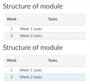
Give your tables a Bootstrap feel with, striped rows, hover highlight, etc (see CANVA101 course for full description)

<table class="ic-Table ic-Table--hover-row ic-Table--striped" style="border-collapse: collapse; width: 100%;">
    <thead>
        <tr>
            <th style="text-align: center;">Week</th>
            <th style="text-align: center;">Tasks</th>
        </tr>
    </thead>
    <tbody>
        <tr>
            <td style="text-align: center;">1</td>
            <td>Week 1 tasks</td>
        </tr>
        <tr>
            <td style="text-align: center;">2</td>
            <td>Week 2 tasks</td>
        </tr>
    </tbody>
</table>
Icons for links
Canvas icons can be shown on the left of any link (see Pauleds guide for full list of icons)

<a class="icon-twitter" href="https://twitter.com/allotmentor">Follow me on twitter</a>
Layout
While Canvas appears to provide parts of Bootstrap 3, JQuery UI and Flexbox Grid, not everything is available within an individual page.
Grid
When setting out grids, instead of:
<div class="row">
, use,
<div class="grid-row">
Further details on Canvas’s implementation of Flexbox Grid
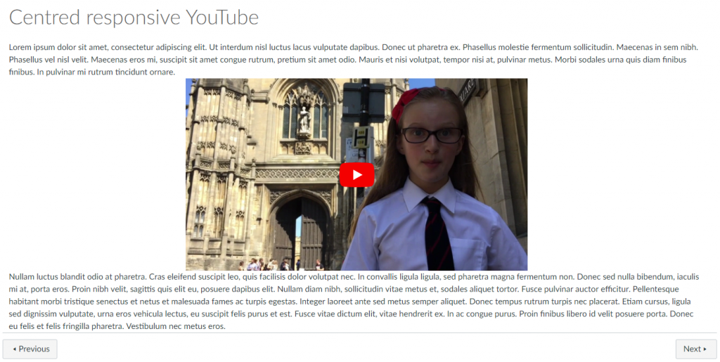
Responsive, centred YouTube embed

Sadly, Canvas doesn’t seem to have included the Bootstrap styles for this, so I use the CSS upload to add the standard Bootsrtap responsive embed styles.
HTML
<div class="grid-row center-xs">
<div class="col-xs-12 col-md-9 col-lg-6">
<div class="embed-responsive embed-responsive-16by9"><iframe class="embed-responsive-item" src="https://www.youtube.com/embed/DFthTUAAMRI?rel=0&showinfo=0" width="300" height="150"></iframe></div>
</div>
</div>
(Note that the width and height attributes are inserted automatically by Canvas but are ignored)
CSS
.embed-responsive {
  position: relative;
  display: block;
  height: 0;
  padding: 0;
  overflow: hidden;
}
.embed-responsive .embed-responsive-item,
.embed-responsive iframe,
.embed-responsive embed,
.embed-responsive object,
.embed-responsive video {
  position: absolute;
  top: 0;
  bottom: 0;
  left: 0;
  width: 100%;
  height: 100%;
  border: 0;
}
.embed-responsive-16by9 {
  padding-bottom: 56.25%;
}
.embed-responsive-4by3 {
  padding-bottom: 75%;
}

