I have been using the fantastic Advanced Sidebar Menu for WordPress – a plugin which gives you configurable widgets which automatically generate a sidebar menu. However, out of the box, the free version lacks (CSS) style – most importantly, some way to indicate whether a menu item is selected and/or has sub-items.
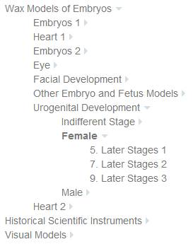
Luckily it provides plentiful classes to attach your styles to – in particular, all you need to tell whether an item is open or not. Combine this with the elegantly simple CSS only technique to generate a caret and you can easily create a simple menu like this (working example on History of Medical Sciences website)
Basic styling
Three styles give me the simple look I wanted:
ul.child-sidebar-menu{
 padding-left:0; /*stop browser indenting too far*/
 }
ul.child-sidebar-menu li{
 list-style:none; /*get rid of bullets*/
 }
ul.child-sidebar-menu li>a{
 color:#777; /*make text a laid-back grey*/
 }
Active menu item
To indicate the currently active item, the developers have given us the
current_page_item
class which is used like this:
ul.child-sidebar-menu li.current_page_item>a{
 font-weight: 700; /*bold for <a> children of the active list item*/
 }
Has item got children
The developers attach a
has_children
class to items with children. We can pick this up and use the magic of CSS pseudo classes to add a right-pointing caret after every link that has children.
li.has_children>a::after{
	width: 0px;
	height: 0px;
	border-top: 5px solid transparent;
	border-bottom: 5px solid transparent;
	border-left: 5px solid #d1dee4;
	content:"";
	position: absolute; /*to prevent it picking up the height of the <a> that is before it*/
	margin-left: 5px; /*now it's absolutely positioned, we need to add suitable margins (not padding which would change its shape)
	margin-top: 5px;
}
However, in big menus, it’s nice to see when an item is open. Again, the developers have given us a class to achieve this:
current_page_ancestor
.
li.current_page_ancestor>a::after{
	border-right: 5px solid transparent;
	border-left: 5px solid transparent;
	border-top: 5px solid #d1dee4;
	margin-top: 8px; /*adjust margin to make caret look as if it has rotated*/
}
But this will only show a down caret on the parent if one of the children is selected. To show it as soon as you can see its children (ie when the parent is selected), we need to add an additional selector as follows:
li.current_page_ancestor>a::after, li.has_children.current_page_item>a::after{
	border-right: 5px solid transparent;
	border-left: 5px solid transparent;
	border-top: 5px solid #d1dee4;
	margin-top: 8px;
}

